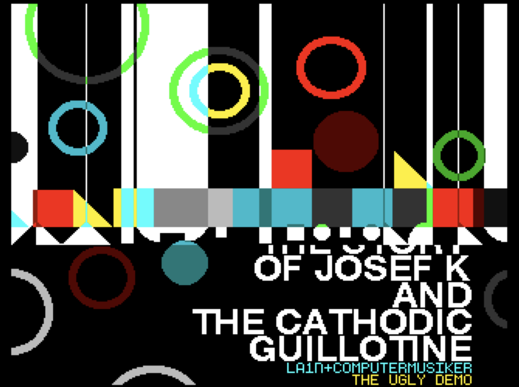
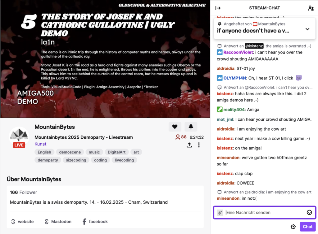
The demo in its final version (without endless display of the Amiga memory).
The demo was written from scratch in assembler. The VisualStudioCode with the Amiga Assembly was used.
Ressources
The resources of the demo – including .adf, SourceCode, Video, some Pictures:
Research demo
The demo “Josef K … “ also contains some research questions. The following research questions were answered.
Research questions
Of course, there are already answers to all the following questions in the form of demos. Nevertheless, the approach chosen here was to make such a demo ourselves (experimental archeology) in order to experience for ourselves why the demoscene is partly the way it is. An attempt was also made to apply all the categories in the demo itself in order to ‚experience‘ the interactions for ourselves.
The questions and sub-questions:
- Why do all demos try so hard to have a good design? And why is it difficult to make an ugly demo? And what stops a maker* from doing so? (Demo-Brute)
- Why are there very little tile-based graphics in demos, especially on the Amiga (except for scrolling fonts or endless backgrounds)?
- Many demos don’t say much about their design. Why is that so? Can demos be self-reflective and because it’s clear that they can, why doesn’t it happen anymore?
- Many demos do not contain any source code in the demo display itself. Why is that the case? Is there a way to integrate code into the demo?
- Irony: Can demos also be ironic towards the demoscene itself and the demoscene as a community? And if so, how? Problem: parties.
- The stories of demos often try very hard and are often not well told. Why is that the case? How can a classic story be integrated?
- Cultural connections. Very few demos have any kind of cultural connection to existing (culture/art/design) discourses. Exceptions are music/sound and film. Beyond that, there are very few allusions, adaptations of existing texts, plays or films. Are this set rules? And if so, why?
- Inclusion of the specific demo event. How can this be done? Specifically, it was about the fact that MountainBytes has always had cows (since the BünzliParty) and that’s just very stereotypical (and since I grew up on a farm, also a bit too bünzlig). How about putting a „Naktwanderer“ (Nude hiker) in the limelight (also a very “Bünzli” theme in CH) [Bünzli: average swiss persons with some problems]
Development
The initial idea from the beginning was to do something about one of the most significant and defining restrictions in the history of the demoscene and computer games: the grid beam. So the idea was to take something from history and implement it somehow. Because the grid beam is a kind of fetish of the scene. The developer community has been fighting over it since the Atari 2600. Always on the beam back then. There was no video memory. The game had to wait until it was in the right place to draw a sprite! Not quite as perverse, but still: it was always about the drawing beam in CRT televisions and monitors. And then came the orgies based on the beam – for example when switching between different modes or different content on the C64 (and games like Maniac Mansion and the demos). Until the Amiga, probably the first and last (home-)computer to appear with an extra coprocessor that only did one thing: process a list and thus virtually virtualize the display on a screen. Whereby the maker came full circle back to the Atari 2600 (Jay Miner).
And the vertical sync was of course the measure of all things. Everything had to be done between the vertical syncs (50x/second), first without and then with double or triple buffering. It was also the clock generator in these machines, which simply ran so fast. With the Amiga, everything should be geared towards this, right down to the clock frequency of the processor.
All in all, entire generations of developers were scourged by the grid and found themselves inspired to work with it. The big hate was the flickering. That was the nogo – the visual image of a technical lag. And if you’re still using old devices today, you’re right in the middle of it again .-(
Basic idea
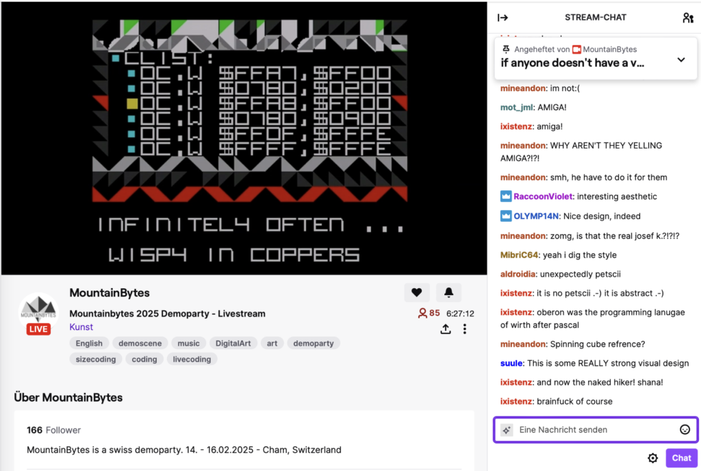
These considerations actually led to slowing down the cathode ray and using it as a hatchet – which in a certain sense it is for developers. Technically, the beam actually draws the image. In other words, the cathode ray reveals the world. This was tested with the GameEngine CryAmiga. From the beginning, the Amiga was used differently than it was intended. The Amiga has bitplanes as layers, which only form an image when put together. The color value of about 10 is divided into different bitplanes, in this case 0 1 0 1 0 0 … resulting in 0*1 + 1*2 + 0*4 + 1*8 ….. This makes manipulation of images massively difficult and slows down your amiga hardware with blitter (graphics processor). I used to have the idea that these bitplanes were layers and you could work with them (like Photoshop years later). And so – like some demos – I used this effect and split the colors r(ed *1) + g(reen *2) + b (lue *4) + w(white *8) and the rest are mixed colors. Then I used the layers individually and the computer automatically makes the corresponding mixed colors out of them. Just as these bitplanes should be as layers .-)
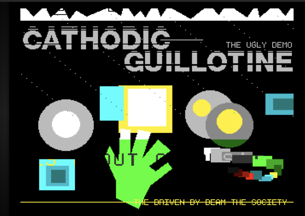
The result looked like this.
The interesting thing here was what happens when the guillotine (a bitplane color 1) is dragged through just one layer, thereby changing the graphic: The values on the layer are deleted. The color part that is deleted is 1. The color 1 becomes 0. 2 remains. 3 becomes 2. In other words: The first bit is always deleted: 0abcd …. 0+a1^2+b2^2 etc .
This creates very interesting and, in concrete terms, quite uncontrollable effects. In other words, all I find interesting about generative generation is a different perspective. Things that are familiar from Photoshop layers and combinations like add/sub/invers a layer.
You can actually watch this effect for hours and be surprised again and again at how things change color in certain places. And the effect cant be endless fast. Then you loose any possibility to follow the effect(s). In most demos, this effect was then ‚extended‘ and adjusted in terms of design so that it results in a ‚beautiful‘ effect in terms of design.
One game from the CHLudens corpus that uses this effect ‚beautifully‘ is probably Necronom 1990, where there are strangely few colors but many scrolling simple “bitplanes”/levels. Two layers 1 2 (both half white) becomes ‚real‘ white.
Now the question arose, why can’t the effect be just as raw and “brute” – does it have to be as beautifully crafted as in the demos or Necronom?
What prevents you from making it just as raw? Too childish? Too naive? And what about the high level of abstraction of the whole thing? What happens if the effect is so slow? The average demos works with music and speed! I guess this demo was something that doesn’t impress with the blatant technical possibilities on the Amiga 2025.
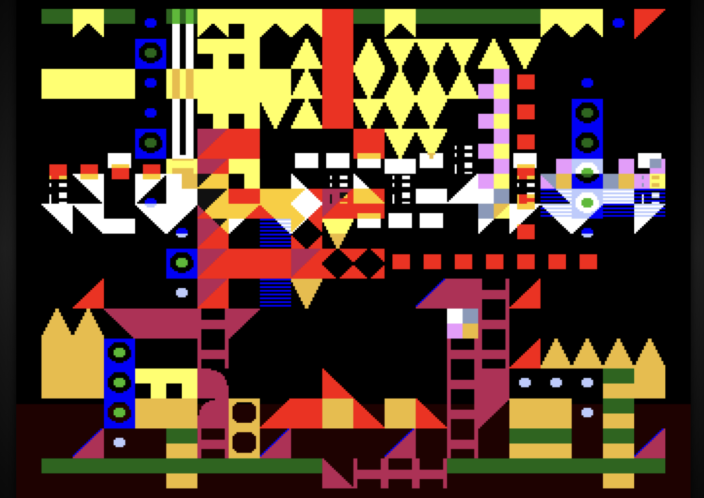
After that, the first versions were created with predefined drawings from predefined tiles that depicted something. However, the whole thing no longer achieved the ‚artistic‘ effect of this first demo, as it was no longer just about the effect but about recognizing the content. Would the demoscene find such an ugly demo (more like 90s art) interesting? [Or was it too easy for them, especially as the whole thing is reminiscent of glitch art? It also became clear very quickly that purely randomly generated worlds weren’t all that exciting.
This is why the first interesting impressions were created.
The image was always different after the grid and had to be reinterpreted.
The use of the GameEngine also made the development iteration and the loading quite long.
Because the CHLudens demo was still being developed, the idea (the old dream) was to start again and try out how complicated it was to draw everything in DeluxePaint, i.e. to have all the tiles in one picture. At that moment i used the cryAmiga-Tile-Tool.
„New start“
The demo has now been redesigned with the idea of also having a scroll text in which the demo would be spoken about directly. The scroll font was also implemented again with sine movement. However, the whole thing disturbed the flow of the guillotine, even though there was a version where the scroll font moved upwards and was ‚knocked down‘ by the simulated grid. Making the guillotine a scroll font wasn’t really interesting either, again it obscured the basic idea.
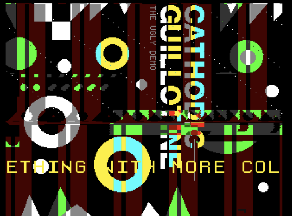
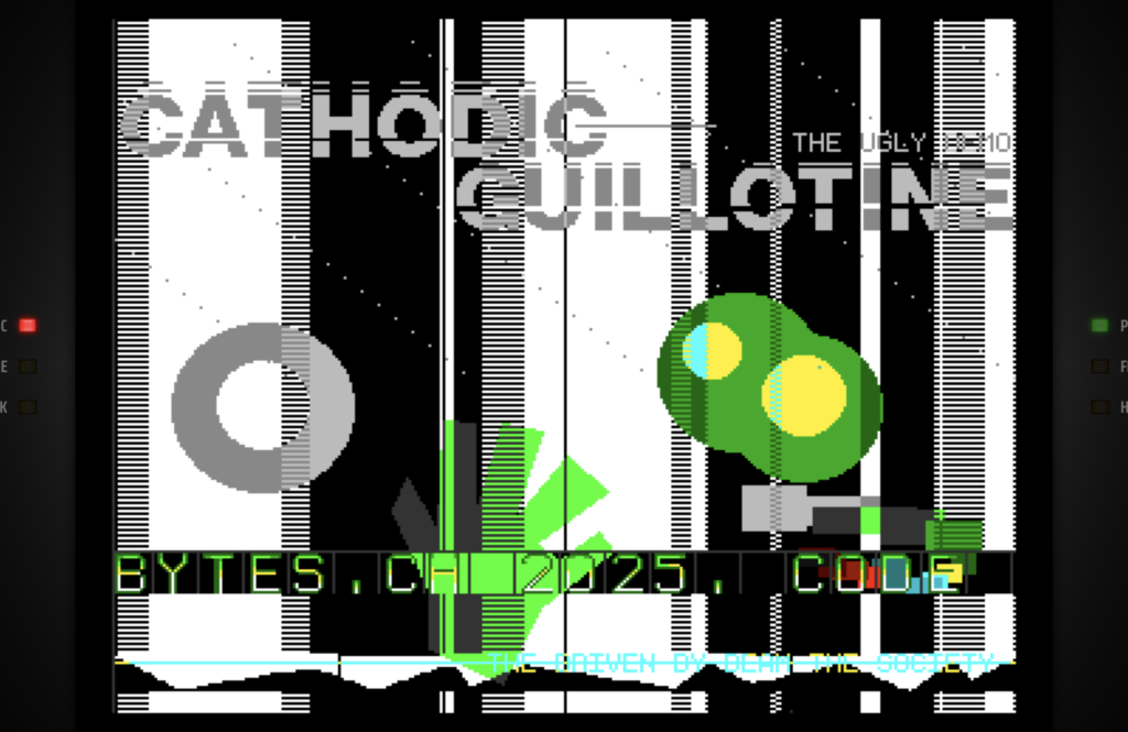
I also experimented with the fact that there is a bitplane that runs from left to right and thus produces additional effects.Visible in the image above at the overlaps with red at “ODIC”.
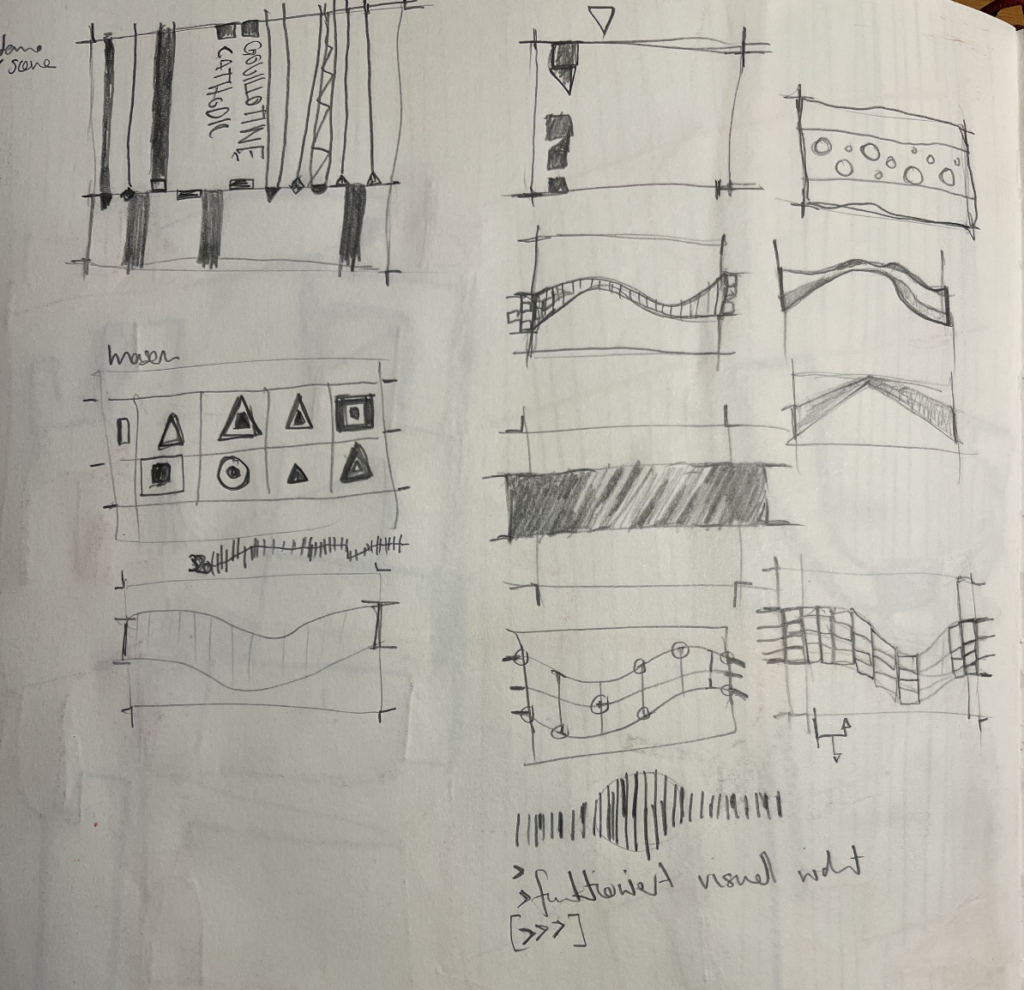
Enclosed are sketches of the inclusion of the scroll font.
However, in the end this was far too chaotic for a classic demo.
All in one screen
But now the whole graphic for the demo was loaded once into the memory and than was copied. This was much simpler than always convert the data in the blits. This was in the beginning the same structure as in the CHLudensDemo.
Tiles and their wipes in demo design (vs game design)
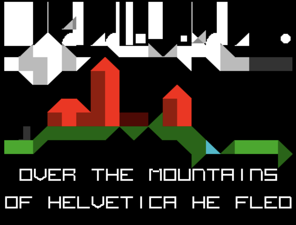
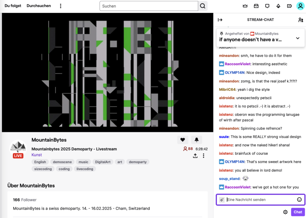
There was also an attempt to leave larger graphics and work less with tiles. It seems – even if you look at the demos of the 80s/90s – that tiles are not popular, they rarely appear or are only used as an auxiliary technical construct. The idea is rather to get away from this legacy of game consoles. There are many reasons for this, but one of them is certainly that good tile design is extremely difficult: how do you create something that looks repetitive and yet unique? It’s definitely a challenge for the demoscene (who does it, how do you process it) and of course everyone wants to get away, be bigger and better, dissolve grids. This type of design can be observed above all on the Amiga. This is also supported on the hardware side of the Amiga with the blitter and so there are few demo launches that work with tile-based designs (except for the fonts and endless backgrounds). For games, on the other hand, it is often an issue and it is also the easiest way to create worlds. The demo design seems to focus more on individual moments. This demo therefore also has a break in the design and first uses larger graphics and then switches to tile mode for the story. This also simulates what many demos have: Breaks without the same effects and styles. But in both parts there is the cathodic guillotine.
Larger and more representational graphics
And so an attempt was also made to work with larger figures (without a grid), as in the demoscene mainstream.

Or even more concretely.
However, this quickly leads to a lot of effort and the question of how to bring the different things together. Things that usually don’t work so well with many demos from the 80s and 90s.
Stages
This made the demo more like a staged demo. The effect was expanded to several parameterized effects and thus staged. The narrative mechanics were therefore more a succession of effects that somehow belonged together. It was more of a visual narrative than a content narrative. There are many demos of this kind. It’s an obvious way to organize and stage demos. Here is an example with faster guillotines and a corresponding effect. Again, more of an art interpretation than a classic smooth type of design that exudes control. Glitches have also become more popular in the demoscene, but they still raise questions: How designed is it? Does it have to be? (And: ok this seems to be more art than a demonstration)
However, the beginning of the realized demos in particular uses this type of staged effect. However, too much video media art of the 90s was avoided. The reasons: Probably too much to get used to.
But it also quickly became clear that it couldn’t be that alone.
Technical-cultural connection
Many demos lack a reflection of their own technology (of their own madeness), but that is also what the development of demo programming is all about. Ultimately, it is always about technology and its culture. In the following, an attempt was made to incorporate the technical basis of the guillotine of the original source code in the scene. First in the middle. That was a bit striking. The whole thing then moved from the very bottom to the top in the final version and became the counterpart of the beam. They fight with each other. Ultimately, it’s the battle of the developers* against the hardware and the limitations.
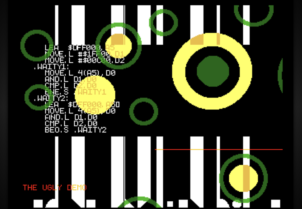
This also resulted in an interesting, rather meditative effect: the beam that overwrites itself.Of course, the effect is technically banal.
This effect then became the general effect of the demo, which is used again and again.What is interesting here is the slowness and the emergence of an eternal vertical-visual structure that overwrites itself again and again at random. It is, what remains in the background on a meta level. It is also used with the final demo to visualize the nirvana of Josef K and the ray. Of course, the cross-reference to the cracker/demoscene method of the 80s/90s of smearing images when fading in is also interesting here.
// Creating collections was by the way also a „Product/Service“ of the Crackerscene.
Of course, the guillotine effect becomes really interesting when it cuts through an existing image.
The music-visuals complex
Demos are also music-driven with the exception of size coding. In most other demos, the music and the visuals merge into a kind of musically and visually integrated design. In the case of this demo, the music was chosen to further enhance the guillotine. So it is music in the techno realm. The beat is like the hatchet of the cathodic ray: „Hack hack head off“.
The non-cultural links of the demoscene
Normally, cultural movements differentiate themselves from other (older) movements – for example, from the current art movement. The punks against the establishment, etc. With the cracker and demoscene (and also partly the game design scene), something completely different happens: there are practically no references to the classic design scene or art scene. It’s as if – and it is – it was created without a struggle. As if it had taken nothing as a model and worked off of it. No literature, no theater and almost none of the great films are quoted or visually incorporated. The question of influences is also difficult in this scene – music and then often the “scene” again. It certainly plays a role that part of the scene was very young and practically appropriated the whole thing itself, was very technology-oriented. Interestingly, this doesn’t really change later on. It was as if a scene had moved in here that didn’t fight with the rest and simply carried on. Timeless.
However, this is ultimately difficult because the whole scene lives in its own world independently without visual/music connections. The lack of links is also always evident in television interviews – where it usually boils down to the fact that everything is in real time. Yet most media, even television, work more by spinning stories further, by writing new connections to the intertext, and it is precisely this area that the Scene serves little or not at all. It seems as if the visual style has gone its own way and has differentiated itself and not against art, not against the abstract, for example – although much is very abstract. and it is interesting to see if there are common pixelated pictures and they clash against art/design of this time.
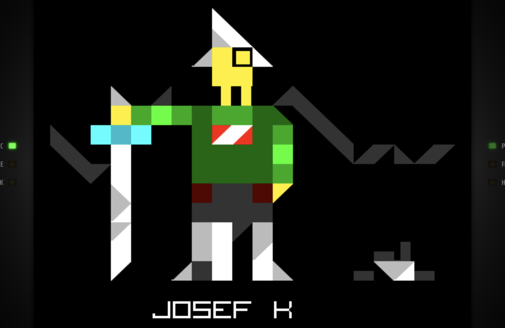
Cultural connection – Josef K
And so the question is what happens when you bring in classical culture. For example, if you insert a story with pictures and name the protagonist Josef K. In other words, naming the main protagonist after Kafka’s character, who appears in his novels. Kafka and his texts were not chosen randomly, as he is one of the great storytellers who works with cybernetic concepts. Kafka’s texts often deal with sets of rules and systems – mostly social systems. Mehr dazu hier >
The Story [Parts]
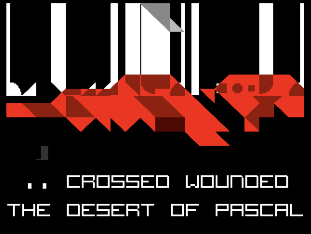
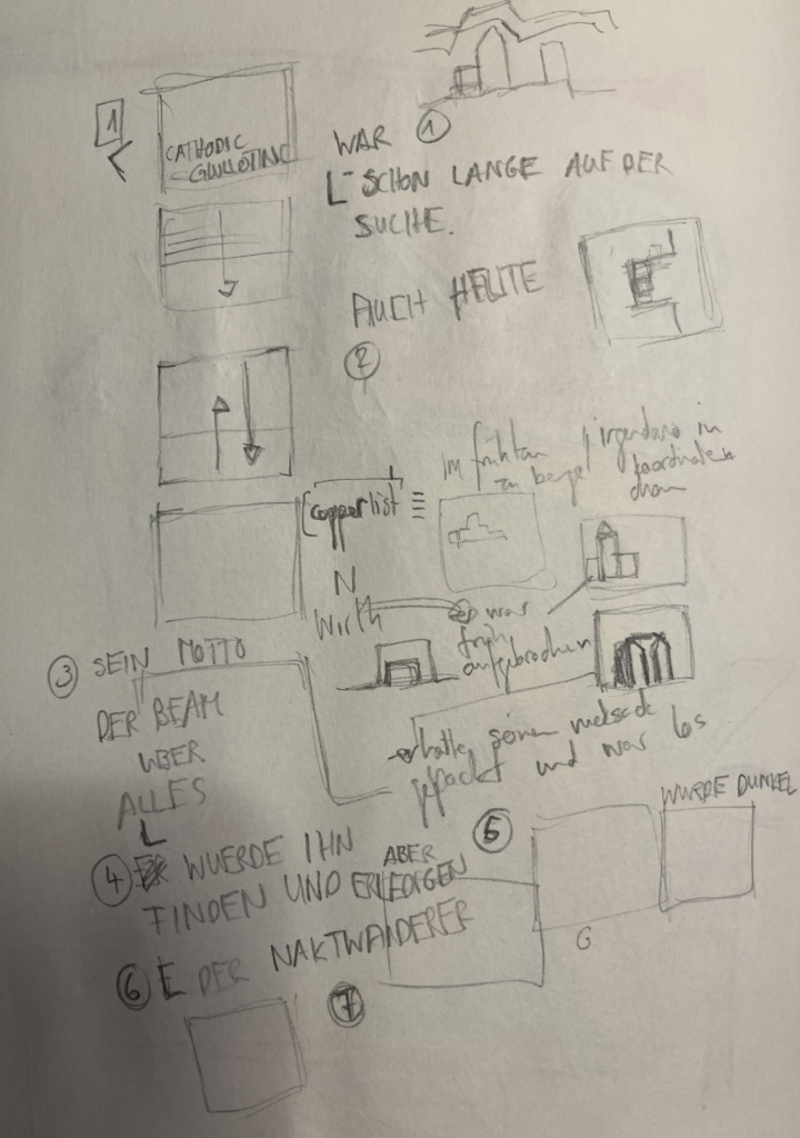
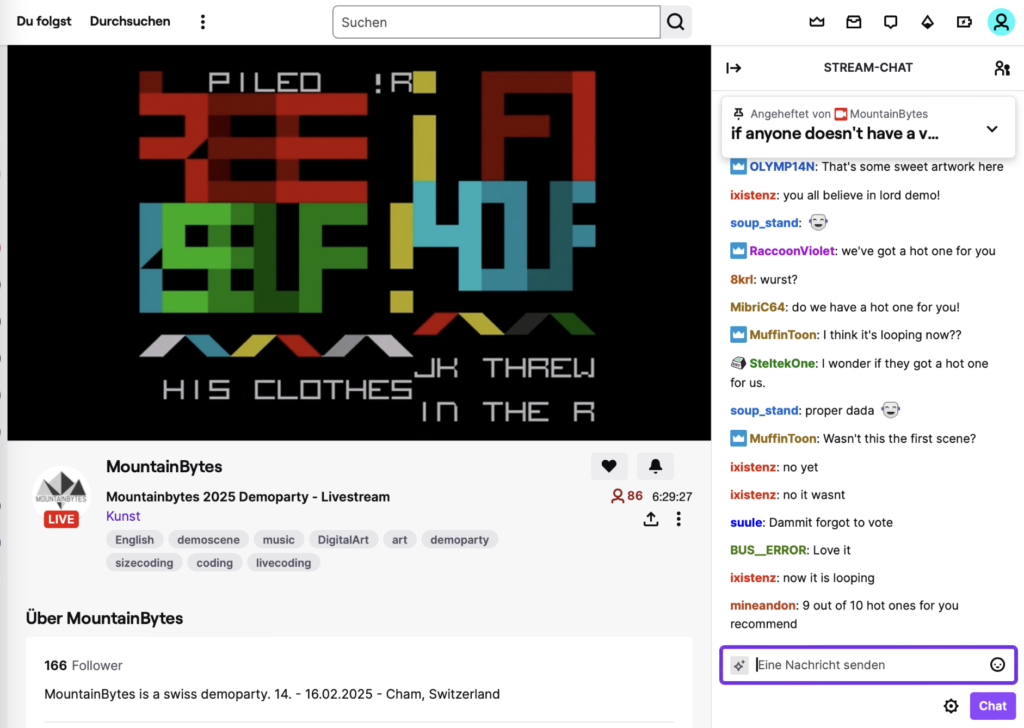
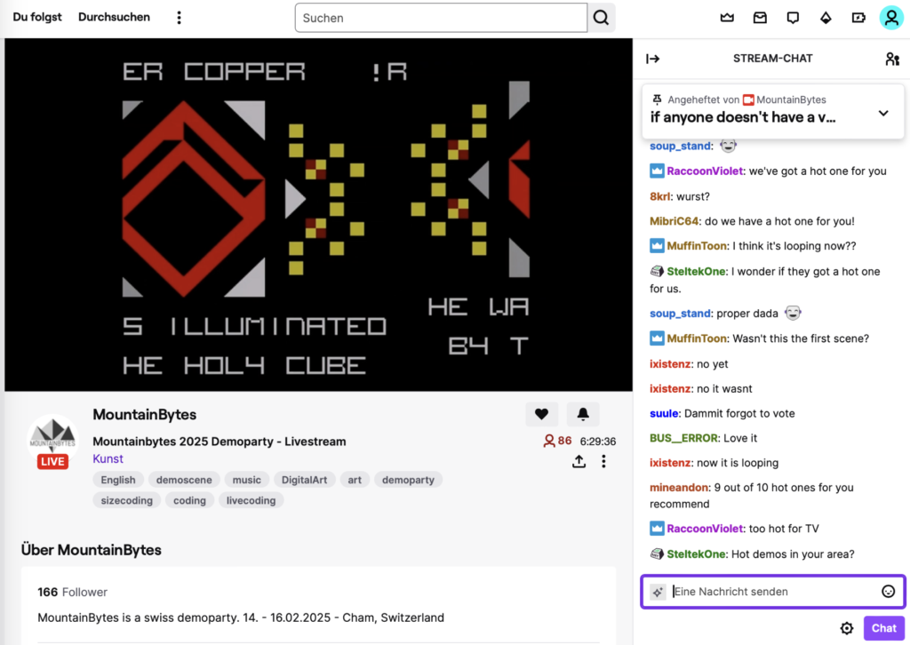
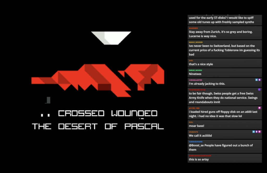
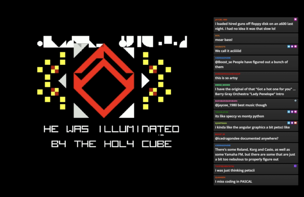
Josef K is now the great fighter who wanders through the world of the 80s with his sword and takes down the great enemies (Oberon, Pascal). So he escapes his rules for the time being, has an epiphany and begins to have new experiences as a naked. He steals the Brain from Fuck in the Valley of FALSE. These are all allusions to a time of development. He prays to the copper – the coprocessor of amiga etc.
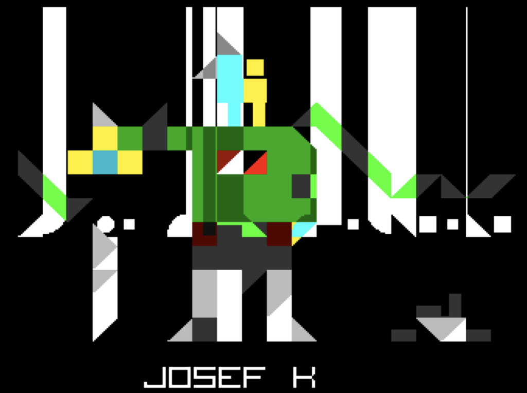
Part of the story is visualized here with screenshots. The raster axe destroys the screen each time and makes something new out of it.
The post ray Josef K. as a consumer*, you may now ask yourself, what is this? Is there a change?
It is not easy to pull off this type of visualization because it is very anti-plastic and almost graphic design (flat and stylish). The previous work on SQUAREZ certainly helped here. In the swiss context you would of course come across the graphic artist Warja Lavater, who also worked with grids and simple graphics – albeit far more radically. More about Warja Lavater >
It is also about swiss digitization history with Niklaus Wirth, the inventor of Pascal and Oberon.

And some allusions to the graphic design of the 60s/70s. Here, for example, the well-known swiss globalization font helvetica, which is of course ambiguous here.
Trying to find a story is not easy. Is it about finding the story that works like a classic demo or is it about connecting the cultural with the culture of the demoscene and its fetish for the sword of damocles grid beam and if – does the scene find it funny when you make fun of them? On the one hand their own efforts and on the other hand the scene as a whole.
The decision is/was: all together.
Here are some sketches from the development of the story.
Through enlightenment, the hero is transformed, he sheds everything and becomes powerful and more collected. This is again ambiguous, because compiling is also part of assembly development.
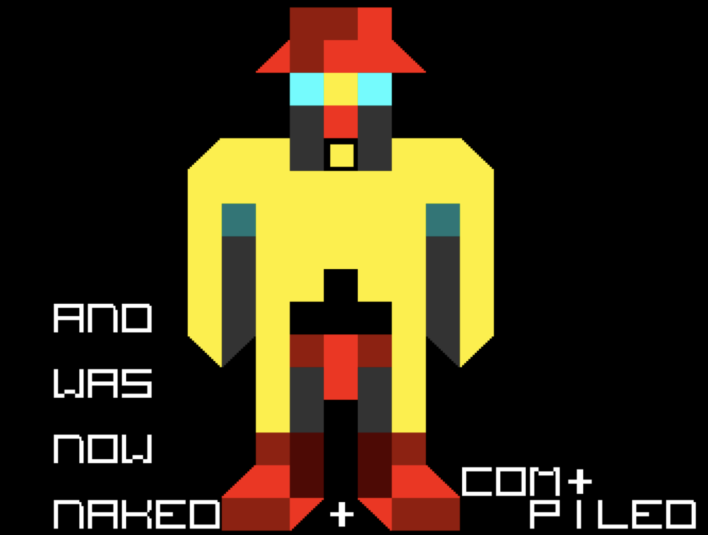
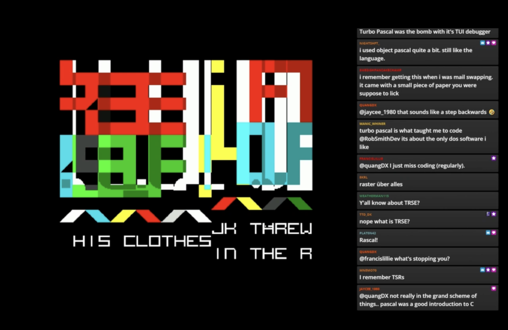
The „Naktheit“ (nudity) comes into play because the MountainBytes (successor the bünzli-party) continues the tradition of “cows and Switzerland” and in this sense, of course, the naked hiker (also the discussion is ‚bünzlig‘) should not be missing. And so, after his 1st transformation, Josef K is nude and more powerful. He is the pure flesh. No protection perhaps fast like „assembly“ .-)
He first steals the Brain from Fuck (Brainfuck) and can thus see cyberspace and become part of it himself and also writes his own things.
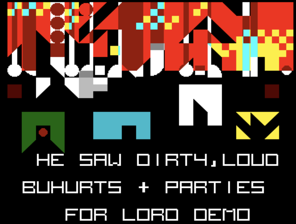
He also sees the future: the dangerous parties with their fights: the challenges (buhurts).
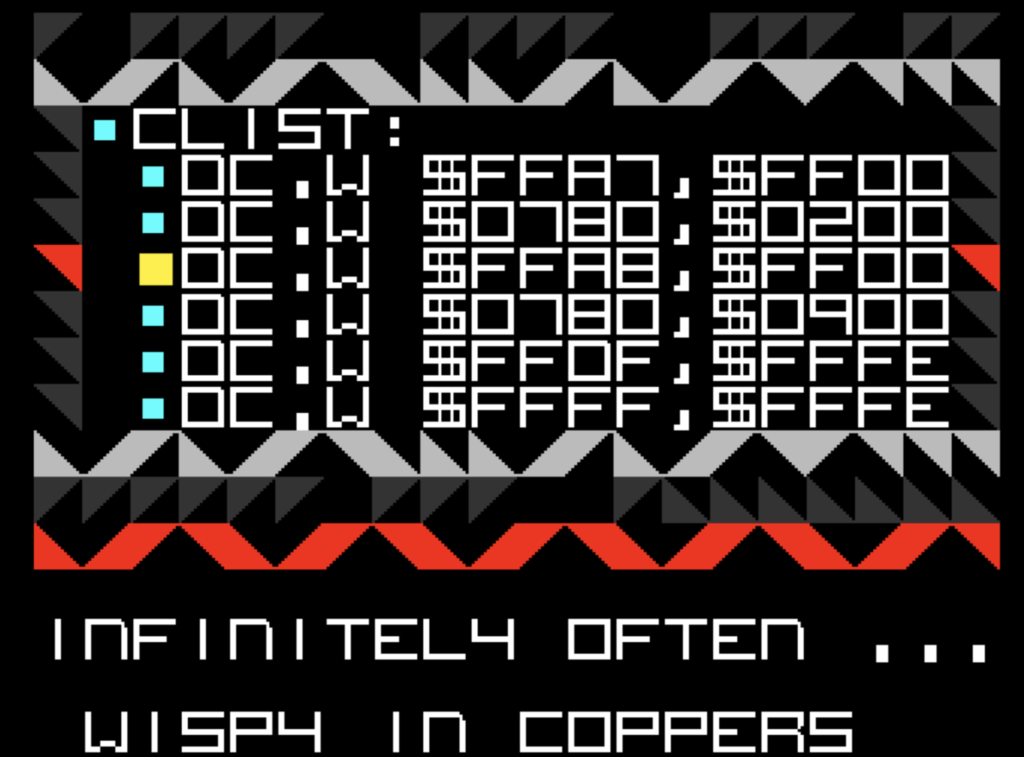
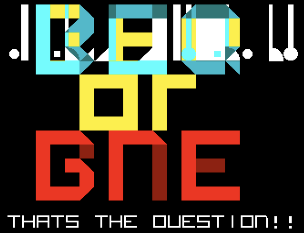
Unfortunately, he starts mixing things up in his prayer: Is it BEQ or BNE. One is equality, the other inequality in the 68000 assembly language(Mac, Atari ST, Amiga).
And so it ends quickly. It comes to a glitch.And prince of VSYNC „kills“ Josef K
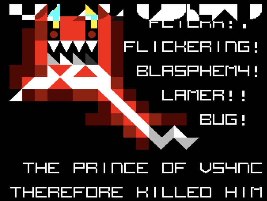
From then on, Josef K lives endlessly in the beam.
In this sense, the story is a simultaneous ride through different cultural worlds, from medieval heroes to the technical worlds to Kafka’s worlds. A mix – but I wouldn’t say it’s a good mukokuseki, because the individual parts are still too recognizable, it hasn’t merged into something new.
Connections
The demo now has more connection possibilities for interpretation, although of course it loses one connection option:
The demos is not a technical marvel with aha-motivation. The motivation to stay tuned (4:40 min long) could lie in a mix:
- Simply as a visual experiment
- As a story in the demodevs/designer milieu
- As an ironization of the efforts of demosceners* and the scene in general
- As a story that follows on from the literary canon and spins it further
With this in mind, we’ll see how the demo performs on release.
Next Step: Publishing and reactions
The final step is now the publication of this research demo at mountainbytes.ch 2025 and the evaluation of the reactions there.
Results of the research questions
Many of the research questions have already been discussed in the text. The method of experimental archaeology as such was again somewhat successful. Some questions only arose during the development process: Is there a distinct style? Why are many demos not connected to other discourses, etc.?
In principle, the self-production of a demo has led to a “feeling” for the potential space of demodevs* in the 80s/90s and thus to a different approach to the analysis and interviews.
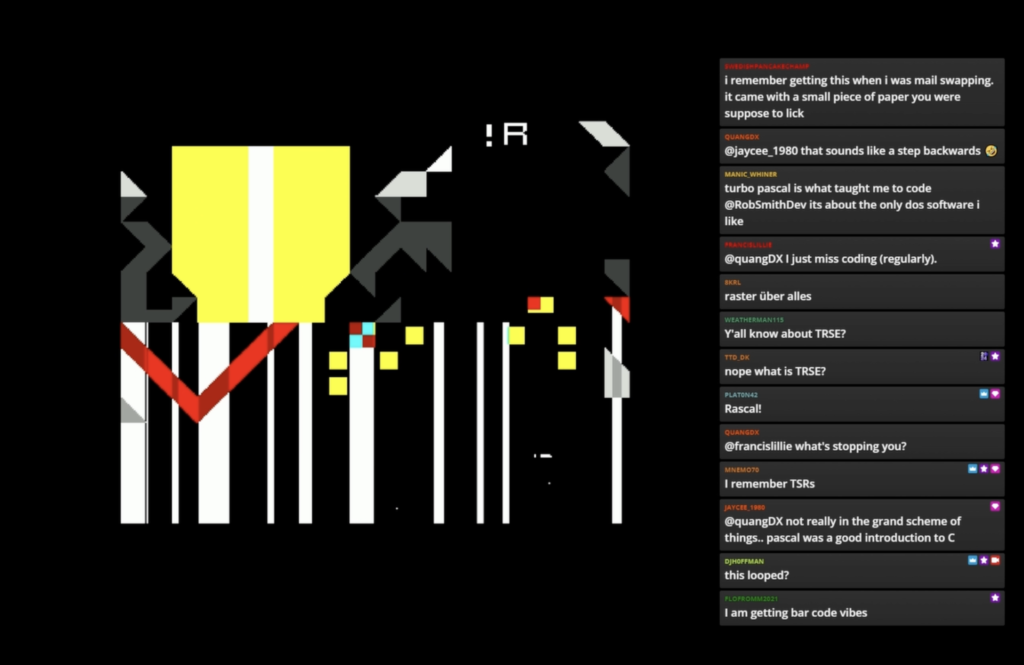
Reactions (18. March 2025)
The reactions are surprisingly positive (although it is unclear whether the others simply did not get in touch).
Unfortunately, I wasn’t at the demo party. That’s why the live observations are missing here:
E: During the event (TwitchChat)
V: Videos and Comment
C: After the event comments (pouet.net)

Topics
Overall & Idea [6]
C
Oh, wow! This stands out! (slumgud).
this was great (grz).
Interesting prod! (steffest)
Mesmerizing. (Saga Musix)
what korvkiosken said, but novel and interesting enough (bifat)
Interesting idea, but drags out…. (Frequent)
Style [20]
E
interesting aesthetic (RaccoonViolet)
Nice design, indeed (OLYMP14N)
yea i dig the style (MibriC64)
unexpectedly petscii (aidroidia)
This is some REALLY strong visual design (suule)
That’s some sweet artwork here (OLYMP14N)
V
this is so artsy (???)
that’s a nice style (8KRL)
i kinda like the angular graphics a bit petsci like (DJHoffmann)
i was just thinking petscii (???)
Shades of teletext (???)
I am getting bar code vibes (???)
C
I really like that graphic design! (Olympian)
| very, very nice! cool design, very thorough concept (read the making-of!)… it really works. a well-deserved placing. (dipswitch)
ThumpUp (Depeche)
Real fresh visuals. Just love the design. (slumgud)
Looks great in stills, but gets really tedious after a while. (Korv)
Cool design (steffest)
Special style and content, liked it during the party. (Chainsaw)
great style but drags on too long (SIR)
Music [9]
E
we’ve got a hot one for you (RaccoonViolet)
do we have a hot one for you! (MibriC64)
I wonder if they got a hot one for us (SteltekOne)
proper dada 🙂 (soup_stand)
V
We call it acid (Mneo079)
moar bass! (8PxL)
I have the original of that „Got a hot one for you“ … Barry Gray Orchestra „Lady Penelop“ Intro (DodgeMoods)
C
Music is really not my cup of tea but somehow works (slumgud)
The music is rather awful IMHO, but nothing the volume knob can’t solve. (steffest)
Technical background [13]
Imagine understanding what’s happening at all in this demo, I don’t! (minebrandon)
I miss coding pascal (???)
Turbo Pascal rules (MNEMO70)
It was my first „proper“ langauge I learnt after BASIC (ROBSMITHDEV)
I did quickpascal at colleage (JAYCE_1980)
Borland Turbo Pascal was my JAM!!!! (QUANGOX)
i went from basic to 68k assembly on the amiga .. and then pascal at college before learning C :_) (JAYCE_1980)
Turbo Pascal was the bomb with it’s TUI debugger (???)
i used object pascal quite a bit. still like the language (NIGHTSHIFT)
Pascal is what taught me to code. (MANIC WHINER)
raster ueber alles (8XPL)
not really in the grand scheme of things.. pascal was a good introduction to C (JAYCE_1980)
Culture [4]
E
zomg, is that the real josef k.?!?! (mineandon)
Spinning cube referen? (mineandon)
C
May the Sacred Hexahedron bless Josef K., poet of the cybernetics! (ham)
Special style and content, liked it during the party. (Chainsaw)
WriteUp [2]
The WriteUp is often mentioned and it was worth publishing the WriteUp at the same time.
C: Also very interesting writeup. (slumgud)
Cool design (steffest)
Initial conclusion Publication
The simplest evaluation: Counting the individual quotes on topics. Style wins by a wide margin (20), followed by technical background (13), which was pushed by a discussion on the topic of Pascal. And then music (9). The overall/idea comes next (6). This is followed by the culture (4) and the write-up (2).
This shows – at least in this mini-evaluation – that the three themes of style/design – technical background and music seem to lead the way as themes in the textual evaluations. The idea also seems to have been somewhat important.
It seems that some of the design themes were included in the demo. However, it is also clear that the additionally introduced non-demoscene-typical topic Josef K is not really considered or visibly discussed. The technical references (Pascal, Assembler, etc.), on the other hand, seem to generate follow-up communication. It is unclear whether the discussion of the meta-topic VSYNC/Fallbeil has arrived.
More Comments
„MountainBytes 2025“ (bryn) wrote a text about moutainbytes and her impressions there. She also created an own entry for the party.
More interesting was the second place winner, The Story of Josef K. and the Cathodic Guillotine, whose blocky shapes told a rather oblique mythologically flavoured story full of Swiss computer history allusions and injokes, which then starts jumping around to various parts of the scenes seen so far. This felt like proper outsider art, which is to say I didn’t entirely get it but it certainly had a vibe to it. The creators express their intent in some detail on a writeup released after the compo: they wanted to break various conventions, tile-based graphics, cultural allusions, as well as exploring the technical ideas being explored (the cathode ray beam, moving bitplanes and the ‘guillotine’ effect it applied to the image).
I now know that the technical limits of the Amiga are… really damn high. But this compo demonstrated to me that the demoscene is, or can be, about a lot more than pushing the limits of graphics techniques.
Also interesting was la1n’s entry, a Space Invaders-style C64 game that fits in just 254/384 bytes. This one also received a thorough writeup explaining how such is even possible—through left-field programming, that’s for sure.
https://canmom.art/adventure/demoscene/mountainbytes-2025
Jolie demo et article intéressant 🙂